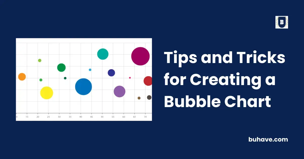
Are you interested in presenting complex data in an easily understandable, visually appealing way? If yes, then bubble charts might just be what you need. A bubble chart is a data visualization tool that can efficiently illustrate complex relationships between three or more datasets in two dimensions. In this article, we will cover some useful tips and tricks to help you create effective bubble charts.
Understanding the Basics of a Bubble Chart
A bubble chart is often used to display three dimensions of data. The x and y axes represent two dimensions, while the size and often the color of the bubbles serve as the third dimension. This type of chart serves as a viable choice when you need to show and compare specific relationships between your datasets, such as engineering, economic, and statistical data.
Just like other charts, a bubble chart is not without its complexities. Knowledge of the basic principles of creating a bubble chart is essential to make the most out of it.
It’s crucial to keep in mind that the space taken by a bubble is proportional to the value plotted. Hence, it’s essential to ensure accurate sizing to prevent misleading interpretations. Understanding these elements helps in leveraging bubble charts to efficiently interpret and communicate complex data to your audience.
Key Elements for Creating an Engaging Bubble Chart
Alt text: two hands on a laptop computer used for creating a bubble chart
To create an engaging bubble chart, it is helpful to consider several key elements. First and foremost, the data used should be relevant and accurate. It should be carefully selected to ensure it provides the audience with meaningful information.
Secondly, the choice of colours and sizes of bubbles should reflect the datasets accurately. The colour scheme should help the user understand the data quickly. Similarly, the size of the bubbles should mirror the data points they represent to avoid misinformation.
An efficient bubble chart should also be clean and uncluttered. Too many bubbles or numerous overlaps can make the chart difficult to interpret. A legend or guide should be included to facilitate understanding.
Last but not least, the title and labels should be clearly written and easy to understand. They should succinctly describe the data being presented.
Steps in Building Bubble Charts From Scratch
While there are several tools available for generating bubble charts, it is possible to build them from scratch. The key is understanding how the chart works. The first step involves organizing your data, determining the variables that will be represented by the x and y axes, and the third variable for the bubble size.
Afterward, lay out your chart area, marking out the x and y axes and plotting the data points. The position of your bubbles is determined by the variables on the axes while the size is dictated by the third dataset.
It’s important to choose the right scale for your bubble sizes. Be aware that smaller bubbles might go unnoticed, while very large bubbles may overshadow the other data points.
Finally, color can be added to represent another data variable, further enriching your bubble chart. Once the chart is complete, always remember to include a legend and labels.
Applying Advanced Techniques to Improve Bubble Charts
Alt text: Rainbow color arcs to show how color theory can be used in creating a bubble chart
Beyond the basics, there are several advanced techniques that could be used to improve the quality of bubble charts. These include the use of dynamic attributes to represent the change over time, interactive features for better user engagement, and refined aesthetics to make your chart more visually appealing.
For instance, you can use an animation effect to show changes in data over time. This can make your bubble chart more engaging and informative.
In terms of aesthetics, simple techniques such as using a monochromatic color scheme for the bubbles can enhance the overall look of your chart without distracting from the data presented.
Additionally, incorporating interactive elements can greatly improve user experience. Inputs such as sliders or dropdown menus allow the viewer to control what they wish to see at any moment.
Altogether, creating an effective bubble chart requires understanding its basics, selecting relevant data, and implementing both basic and advanced techniques as appropriate. Avoiding common mistakes can ensure your bubble chart delivers the intended information accurately and engagingly.
– If you are looking for guest posts write for us education now.

